Posts

Showing posts from April, 2018

Dry Skin Packagine

Image
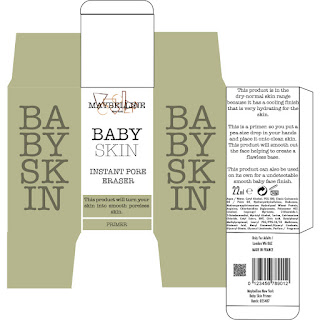
Final Packaging - Dry Skin I have finished my final packaging for the dry skin range. This page shows you both the finished off shelf product and the finished design before adding in the safety requirements. I stayed with the same layout through the packaging, this was important for me as I wanted them to look like they are in a set and are meant to be used together. When necessary I have had to move things around but thats because of the space I had on that box size. When fitting in all the correct safety requirements I sometimes had to tack out some text or move around text that I had placed down before. This is another reason why I put the original image in of before I had to add in the safety requirements.  Dry Skin - Primer Dry Skin - Foundation  Dry Skin - Concealer Dry Skin - Contour Dry Skin - Highlighter Dry Skin - Blush Dry Skin - Powder Dry Skin

Halfway Evaluation

Halfway Evaluation I am half way through my FMP project now and I want to look over my current work and do a brief evaluation about how I am doing as well as making me have a better idea about what I need to focus on in the final half of the project. I feel like I have stayed on track quite well, this is due to me having kept vivid notes and lists in my journal of what I have been doing in my lesson as well as always making clear notes and to do lists when I feel slightly behind. I feel like because of this I have got a lot done with my project which I’m glad about as I did say I was going to do a lot in my product proposal but I am still aiming to meet as many of those goals as I can.       When I started this project, I had to write out my project proposal sheet which would show where my FMP project was going to be based on. I chose my own theme because I didn’t feel a passionate drive with any of the provided themes. This is why I came up with me working on a project that i

What I Want For The Packaging

Image
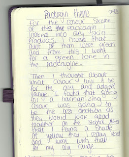
The Packaging Target Points When designing the product packaging I want it to be for the three starter ranges, dry skin, oily skin and aged skin. This is the part of the project where I`m not trying to be the most creative with the shape of the packaging as I don't want to make really different packaging but I want to have different designs on the packaging that stands out from what Maybelline would normally do. First I had to look at what colours I wanted to use. I know that I want to use different colours for each range so that its easy to know which colour you should be using. This helps if the stand got messy and there was products in the wrong row you would know elementally because of the different colours on the box's. I have talked about this process in my journal as that's were I first planed out my ideas but I though to look up dry skin products to see what other used when being associated to try skin. I found out that most products were light green colours