Posts

Showing posts from March, 2018

Peer Assessment

Image
  This peer assessment was the first one I did with a peer in class. This was a very detailed assessment as it went into detail of all the assessment points so this really helped me pin point where I should focus more of my time.  This second assessment was less detailed but it helped get another opinion on my work and also gave me areas to where I have been doing well and might need more work.

Final Logo

Image
My Final logo In my zine I show my process of getting to this final design.I also talk more about why I liked this design with all the pro`s and con`s of the logos that came as close runner-ups. I also talk about the best way to use this different layouts and how it fits my target requirements.    These are my final logo mock-ups my main logo will be the one on the left but I had to make other designs for when my main logo wont be suitable. When designing a logo this is very important as the company might need the logo to fit into a space that the main one can not. This is why I made other smaller designs so that they can be used for all situations that might occur. This is an example of what other brands do for there different concept logos. This is a very famous brand and they have to have different logos for when its used in all its different forms. This is important as it need to always be recognised.    

Zine Back Cover

Image
Back Cover This is the back cover. This layout was one that I made up on the stop as I knew that I wanted to have the same background as the front cover as well as linking the text. I came up with the "step into the future" because I think it fits right with what the front cover says. I am happy with this and now the whole zine is finished. 

Zine Forth Double Page Spread

Image
Double Page Spread This is my final page in my Zine. I wanted my zine to show the progress of my logo design and this was the final page to showcase the final logo designs and the rules that go with them. I wanted this page to be easy to understand and still pleasing to look at even though I new it would have to be filled with information to explain the rules I am setting for the logo. I still went with the same layout as the other pages having the black and white split page with the Maybelline name in the corner of the page. I am happy with this overall and believe that my zine shows a natural progression of how my logo was designed with a professional feel. This is my sketch with the layout plan of what I was going with and I feel like I stuck to this quite well, the only main differences would be on the second page I added text to it as I though the images needed explaining to show what I was going with them. I made sure to stick to one side being about how ea

Zine Third Double Page Spread

Image
Double Page Spread On this third double page spread I showed on the left some more developed logo designs from my ideas I have looked at in the past. I placed all these on the right so its clear that I was making more then one or two. Then on the left I talked about the three of my favourite logos from the array on the right page. I picked three so I could have a range of different styles. The next page is going to be looking into the one I picked from them final three and developing it into the brand and creating a rule book of how it works.   Once again this is the scanned image from my journal of my third double paged spread. At this point I new the theme of my zine and this page was quite easy to sketched out, knowing that it would have the black and white background as well as the Maybelline and page title. Then I new this page was going to based around my final logo designing process picking the ideas I liked the most ready to go onto the next page witch will showcas

Zine Second Double Page Spread

Image
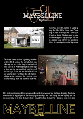
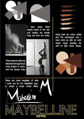
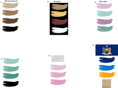
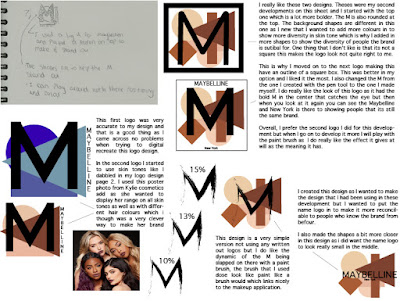
Double Page Spread This is my second double page spread and these pages are more focused on my ideas that I know I want to incorporate into the logo designs. I new I wanted shape, skin colours and brush strokes in it so on the right page that is what I am showing but on the left page I am showing me starting to experimenting with them using images to create shapes as well as using brush paint brush to create logos. This is showing the start of my logo ideas as on my next page I will be creating some real design ideas. Here is the original sketched that I did in my journal when I was planning out the next page on my zine. I think this posses is very important as it saves time when on the computer creating the zine. This page would of been really hard to complete without me sitting down and planing out the arrangement on it first as I wasn't sure how to place my ideas to best show my vision, but overall I am really happy with the layout and I think it relates my creativ

Zine First Double Page Spread

Image
Double Page Spread This is my first double page spread for my zine. This shows what I want to focus  on with my new logo. The right side shows all the beautiful  women that I am trying to include with my new design as well as making it clear that all types  of women were makeup and they all have different  skin tones which is important  for what I am talking about.  This is a scan of my initial sketch of what I wanted the first double page speed to look like. I think I was successful in making my vision coming to life. I did take out one of the written columns as I found that it looked to cramped with text which a zine is not about. I wanted it to still be visually translated.     

Zine Front Cover

Image
Front Cover Options  The first page of my zine has two designs as in my journal I sketched out an idea but I had two ideas for the background. This is why I have two different options here but I have to look into the both and decide which one I think is best shows the message I am trying to send as well as the most ascetically pleasing.      The first idea that I spoke about in my journal was to have past campaigns in the background of the front cover with the text bold over the top saying “THE FUTURE OF” then the Maybelline name logo that I have chosen as my most favourite design. This idea at first wasn’t working out as I haven’t used In design before I didn’t know how to make an image smaller when copying it in, but after playing around with it I figured it out. This allowed me to create the cover you see to the left. The campaigns in the background are older campaigns which I copied over and sized down to fit onto the page, then I set he transparency of each image to

Magazine Research

Image
Magazine Page This is a Magazine that I found on Pinterest, I picked to  analysing this one as I really liked the overall look of it with the geometric theme that ran through the pages.  This magazine uses negative space around the text. I find that I really like the look of this as the images are backed with negative space as well but it is being filled with colour witch makes the image become bigger and able to fill more space in the magazine layout. I think they didn't do this with the text as they wanted the writing to be a stand out and easy to see as it hasn't got a colour filling its negative space. This magazine article is about plant life and nature. If you look at the typography used then you will see that they have used a very clean and simple font style. This is perfect for what they are putting forward. This magazine is using the same font through the headings and title  showing that they are the more important information informing the reader what

London Research

Image
London Research  Camden Market When I was in Camden looking around the stalls and shops I came across a shop called cereal killer cafe which I instantly was drawn to as there use of logo and signing was really eye catching and I was left wanting to now more about what the shop sold. In the three photos I have took you can see that they have all incorporated the  company logo on them. This is when I took out my phone to take photos so I could talk about it as I knew I would want to use it as an example of grate marketing. They have used the logo in the right way it was designed to, as having it on the sign makes it eye catching but then placing it on the seating was another grate way to place the company name and image into the consumers memory. Another point that makes the design fun is that the logo incorporates a milk bottle and they have used stacked milk crates as seating making all aspects relate. Then the icing on top of the cake was that they used the logo

Bob Bernstein

Image
Packaging design Bob Bernstein is a American businessman being the founder and co-founder of mutipul bisnesses but In 1969 and 1977 he worked with the McDonald`s chain to create designs and packaging. Which has been timeless ever since. I know that this man is not the most visionary designer but what I wanted to show from looking into him was how important packaging can be. The happy meal box was first created by Bernstein in 1977. When he first created the iconic packaging it was only realised in four cities  to see how the response was as well as if the design was creating an impact when it came to being useful. After this period of McDonald`s analysing it they decided to make it a world wide product in there branches in 1979, from then the box has had different advertisements on the front but it has always worked well for what it was made for. It`s iconic to children who have grown up with the fast food chain near by. This packaging was needed but it has created an impact that`

Fenty Beauty

Image
Leading Makeup Brand Fenty beauty is a beauty brand that was launched in September of 2017 by the the A-list star Rihanna. She came to fame in the music industry in 2005 and has realised many chart topping albums and signals since then but she has also had successful ventures into acting with roles in major cinematic movies as well as popular T.V series. The star hasn't stopped there with her fashion career being just as successful with the Puma x Fenty team up that has been ruining for many seasons now. Her touch on the brand really helped boosted the popularity as the brands collaboration has created items that have started waves of fashion trends like the flu slides and the platform creepers. What I am showing is that Rihanna has been a very successful and talented artist and business women in her career but in 2017 she showed the world once again that she can do another thing right creating the Fenty beauty line with a major impact. This business inst even a

Paula Scher

Image
Graphic Design Artist Paula Scher is a  graphic designer from  Washington D.C  in America, born October of 1948. She has made major impact in her career working with big brand as well as impcatful movements. Her work is very distinctive and original to her own style making her a massive inspiration. It is very important to have your work easily recognisable as it makes you have a unique style that distinctive to your work and the projects you are working on. She began her career as an art director in the 1970`s and throw to the early 80`s. In this her bold approach to typography became highly popular as well as very influential to observers. In the mid 90`s her she began working with the public theatre  which she went onto help create the landmark identity.   The distinctive designs that she made are still influencing there style to this day with the bright colour theme along with the bright pop art like imagery. Her graphic skills have also been used to help create n

Colour Swatches

Image
Colour Swatches I wanted to play with the colour  schemes so I could analyse what was the best one was for my logos. every element of my logo has to have a meaning otherwise there would be no point in making the change. It would just be confusing for the consumer and for no grater reason. I have played with some colour themes here that i have already used in my design sheets but there is also some new ones. These are some that I have though to be on trend as well as ones that might have a links to the brand. I hope that at the end of the page I will have come to a diction on were I wont to take the colour schemes of my logo and re-branding. This first colour schemes that I put down was one that I have already played with in my design pages, seven and two. What I like about this idea is that it has a positive and  impactful grater meaning. What I mean by this, is that I would like to use skin tones as the company colours. There are thousands of skin tones but in this exa

Logo Design 7

Image
1) I wanted to try and recreate my sketch design as much as possible so I decided to make my own M so that I could make it as bold as I had drawn it. I started of with two of the same size rectangles that I drawn with the rectangular tool (M).   2) Here I am copying and pasting more of them rectangles and lining up like i have done in the past to make sure they look like a real M. I used the rotate tool to turn the middle panels around.     3) This is what it should look like when I am finished placing down the rectangular panels. 4) Now I am selecting all of the shapes and clicking on the pathway tab to click the divide button.   5) Then I am clicking down on the M again with the right button on the mouse and clicking on the un-group button on the drop down menu.  6) What I had to do next was use my select key to pick up and delete the parts of the M that don`t need to be there. 7) I cheeped doing that in till I got to the stage in this screenshot, this