Posts

Final Evaluation

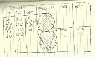
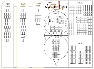
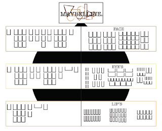
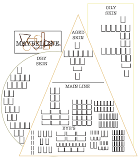
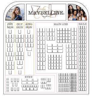
Final Evaluation I’m now at the end of my final major project and I want to look over it all and review it to see where I might be able to improve next time. I am going to start at the beginning by looking back at my initial ideas and why I chose to take this project the way I did. When thinking of this project I new that I wanted to help re-brand a make-up brand so once I had decided on the brand I came up with lots of ideas. Then I came to the conclusion that I would be changing the logo which I always wanted to do but then creating a new design of packaging to help consumers with making there dictions on what products will be best for them as well as trying to make a stand that helped look more organised and less intimidating to customers. I created multiple initial ideas for the logo and stand ideas. There were a lot of my designs that were experiments and after creating a certain design I realised that it looked nothing like what I has in my head. This is good an

Final Stand Design

Image
Final Stand Design When looking at the last design idea I realised that it was the perfect design if I was able to make the small corrections I mentioned on the design page. This is why I wanted to go back and look at the design to re evaluate the design. I new I wanted to make the right side the same  length  as the left so it seemed more balanced. I made the the whole stand connected with a rounded edged rectangle. The reason that I did this was so I could get ride of the semicircles that were above the beginner ranges, after looking at this again I realised I really didn't like the look of the rounded tops next to the square corners. This is why I changed the back to the rounded top rectangle. I used this from my first stand design.     This sketch is showing what the in depth look at what the advertising stand will be. These domes will be holding new products launched in the Maybelline family. I have tried to sketch out a 3D dome to show how the flat image I sk

Stand Design 5

Image
Stand Design Idea 5 This design is the most detailed one out of all of the designs I sketched as I was trying to create a design that was able to use different shapes to make it link to the whole re-brand as well as making the stand more Unique and memorable when in the drugstore. I also wanted there to be enough space for all the products Maybelline provide as well as having space for advertising and product information. This is what I was trying to achieve in this design but I think that I had to change a few thing to reach that goal. I made the circle in the middle to be on top of the triangles, this was because I felt like using the shapes this way around would give a better look as well as leaving more room to use. Like I have said before I really wanted to have a stand idea that meets all my goal and I love the fact that this stand dose and to the parts it doesn't meet with the best outcome like the advertising panels as there is room for them but they would be

Stand Design 4

Image
Stand Design Idea 4 I think this design was the one that stayed most true to the original sketch I did with nothing changing a part from the little point I made at the top to hold the brand logo up.  When looking at this design I have mixed feelings as I really love how simple it is without being so different that space is lost or it looks to over the top for a drug store make-up stand. I think when you look at it you can see it in the drug store being used as to me it look consumer friendly.  My problem with this design is that the new line I have created for this re-brand hasn't really got a clear space to be showcased as they will be sharing the same space as the rest of the Maybelline line. I don't think this will help showcase the full potential of the new rang I created. I also think that even though there is grate spacing for the new range to have diagrams and information panels there isn't any room for that with the existing Maybelline line as well

Stand Design 3

Image
Stand Design Idea 3 When designing this sketch out I changed a few things, these where the spacing between the individual rectangles that are holding the new basics range as well as enlarging the end rectangle. I did this because I new having one thinner stand like I sketch wouldn't hold enough products in the Maybelline line. I also decided to add in two Maybelline logos. This was because I felt the spacing was right due to the feel of having two different sections, One with the basics range and the other with the rest of the normal line. In the last design I talked about how I felt there wasn't enough space for the rest of the Maybelline line but I liked how the different basic lines were displayed, so with this design I put the three beginner stands connecting by two horizontal rectangles. This shows that they are connected under on line i.e beginners / basics line. Then the last end rectangle is connected by one vertical rectangle in between. I also really l

Stand Design 2

Image
Stand Design Idea 2 When I mock-up this sketch on the mac I only had to change one part. This was the placement of the logo. I wanted to place it above the triangle in my original sketch, but I realised that having the logo a good size for it to be viewed easily was going to be to big for the placement I wanted. If I put the logo on top of the triangle it would of covered most of the oily skin section leaving limited space for products and their correct information panel s. When I showed the sketch for this design I talked about how I wanted it to be more unique and modern with its design bending the stereotypical stands that are placed in the drugstores. I feel like I have achieved this with my design as I have never seen anything like this for make-up displaying before and I believe having the relation to the new re-branded logo will help stick in consumers minds. I also really like how there is plenty of room for diagrams and information panels next to the new basic li

Stand Design 1

Image
Stand Design Idea 1 This first mock up of my sketch came out like I though but there was added in parts that I added in when seeing an opportunity. These where the advertisement borders that show off the images from Maybelline campaigns. I thought that after adding in the logo panel  that there was grate opportunity to add in some adverts  that I originally couldn't find a place for in my sketch. I like that this design is simple with its still rectangular shape but adding in the rounded edges makes it different from the original stands. I also really like that the basics range is separated but still works next to the rest of the range. The way the eye's section is also separated from the rest of the make-up line is a pro in my opinion as the eyes are an extra part of make-up and its a skill that most find hard, so having its own section allows the stand to have help guides and information next to the products. The parts I don't find grate about this desig