Stand Design 3
Stand Design Idea 3
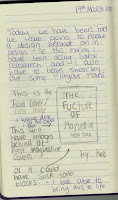
When designing this sketch out I changed a few things, these where the spacing between the individual rectangles that are holding the new basics range as well as enlarging the end rectangle. I did this because I new having one thinner stand like I sketch wouldn't hold enough products in the Maybelline line. I also decided to add in two Maybelline logos. This was because I felt the spacing was right due to the feel of having two different sections, One with the basics range and the other with the rest of the normal line.
In the last design I talked about how I felt there wasn't enough space for the rest of the Maybelline line but I liked how the different basic lines were displayed, so with this design I put the three beginner stands connecting by two horizontal rectangles. This shows that they are connected under on line i.e beginners / basics line. Then the last end rectangle is connected by one vertical rectangle in between. I also really like that I can use this space where this different stands joint to place advertising shoots and product campaigns.
The one part I would change about this is the size of the end rectangle that is holding the regular products. I would make it bigger so that it is balanced with the other side. At the moment to me it doesn't look right with once side longer then the other and I think it would look better when balanced out more, I also think it would be beneficial to have more room on that side so I could design in some room for diagrams and information panel.
Overall, I think this is a design that is in the middle of to simple and to over the top. This design allows there to be use of multiple rectangular panels that creates clear division between the different Maybelline lines as well as doing something different in the drug store as like I said before it can be very repetitive. All make-up stands that are in the drug store are rectangular with horizontal panels to hold up products so this will still be seen as different and memorable to the consumer.


Comments
Post a Comment