Stand Design 2
Stand Design Idea 2
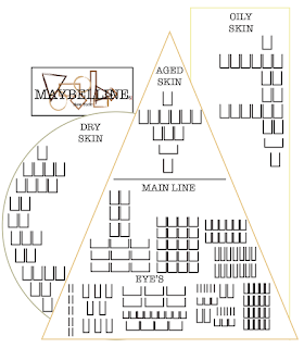
When I mock-up this sketch on the mac I only had to change one part. This was the placement of the logo. I wanted to place it above the triangle in my original sketch, but I realised that having the logo a good size for it to be viewed easily was going to be to big for the placement I wanted. If I put the logo on top of the triangle it would of covered most of the oily skin section leaving limited space for products and their correct information panels.
When I showed the sketch for this design I talked about how I wanted it to be more unique and modern with its design bending the stereotypical stands that are placed in the drugstores. I feel like I have achieved this with my design as I have never seen anything like this for make-up displaying before and I believe having the relation to the new re-branded logo will help stick in consumers minds. I also really like how there is plenty of room for diagrams and information panels next to the new basic lines which links to my original ideas in my product proposal, as I wanted there to be lots of help available to customers that need more help and knowledge about the products they are buying.
My only con about this stand idea is that I don't think there would be enough room to showcase the rest of the items that Maybelline carry as a lot of this stand is based on the new line the re-brand is bringing to the company. This dose concern me, but I think it could be adapted to change to a slightly different design stand to add in more room for the rest of the Maybelline line.
Overall, I think that this stand idea is what I am looking for as it links to the whole re-brand. This to me is very important as having all the new items I have created come together and working as one is the ultimate goal so I would really like to make this design work even if it needs some adapting.


Comments
Post a Comment