Zine Front Cover
Front Cover Options
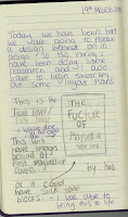
 The first page of my zine has two designs as in my journal I sketched out an idea but I had two ideas for the background. This is why I have two different options here but I have to look into the both and decide which one I think is best shows the message I am trying to send as well as the most ascetically pleasing.
The first idea that I spoke about in my journal was to have past campaigns in the background of the front cover with the text bold over the top saying “THE FUTURE OF” then the Maybelline name logo that I have chosen as my most favourite design. This idea at first wasn’t working out as I haven’t used In design before I didn’t know how to make an image smaller when copying it in, but after playing around with it I figured it out. This allowed me to create the cover you see to the left. The campaigns in the background are older campaigns which I copied over and sized down to fit onto the page, then I set he transparency of each image to 60%. This didn’t look right though as it was become translucent onto a white background so I made the background of the A5 sheet all black so that even when the pictures were at a lower transparency they didn’t look washed out. I really like this design and once I found out that I could size down the images I new that this one would be the one because of how much I liked it. I think that having the past campaigns on the background is a powerful contrast under the wording of the fixture of the brand.
 This is my second attempted at the front cover. This idea came from the though of using different skin colours as that is what the majority of my zine is going to be about. I used a rectangular tool to create the different sized boxes and then changed the colours of the boxes to skin tones. After I did this I turned down the transparency of them down to 50% as the colours were very strong and I though that the text didn't stand out as well as the last one. What I found with turning down the transparency was that it created shadowing between the other boxes were they overlapped. I didn't really like this as I found it very outdated but that could work as a contrast to what I am saying in the title. Overall, I don`t love this one as much and I think I will be going with the first cover due to me felling like the second one dose not stand out and catch the eye or even really show what my zine will be about inside. I want it to be as easy to understand as possible so that its more appealing to the reader.
 This is my second attempted at the front cover. This idea came from the though of using different skin colours as that is what the majority of my zine is going to be about. I used a rectangular tool to create the different sized boxes and then changed the colours of the boxes to skin tones. After I did this I turned down the transparency of them down to 50% as the colours were very strong and I though that the text didn't stand out as well as the last one. What I found with turning down the transparency was that it created shadowing between the other boxes were they overlapped. I didn't really like this as I found it very outdated but that could work as a contrast to what I am saying in the title. Overall, I don`t love this one as much and I think I will be going with the first cover due to me felling like the second one dose not stand out and catch the eye or even really show what my zine will be about inside. I want it to be as easy to understand as possible so that its more appealing to the reader.


Comments
Post a Comment