Maybelline Stand
Maybelline's Current Stands
Boots
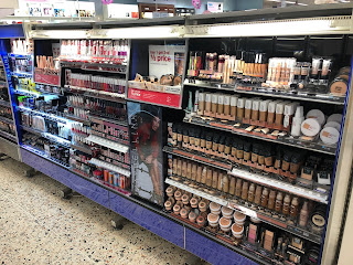
This is a photograph of the Maybelline stand in my local boots. The first thing I notice is that there is three panels at the top that have broke off which is exposing the lighting. This isn't ascetically pleasing and I would hope mine would not be as easy to brake. They are also using a lot of dark blue which the brand used to associate a lot with in the past but in the more current years they have slowly took it out of there packaging. This is another reason why I thing that the Maybelline stands need to be updated. This stand is one of the biggest in the store which is needed as the brand is one of the biggest, what I like is that they have still used space to use some visuals from photoshot and it also has the logo displayed on there. This is good as the top panels aren't there you can see the main logo that would usually be used. I do like the fact that they have most products placed together which would help the consumers that are less familiar with make-up. I still have things I would changed to this stand as i feel like this stand isn't easy to use for beginners and it also needs to be updated to the brands new look that they have been developing before I started this project.
Superdrug
In my local superdrug the stand is smaller but they have the brands panels on the top displaying the brands logo proudly which is better then Boots.I have noticed that they are still using blue in there stand like Boots but they aren't using as much as Boots because they only use it on the logo/brand panels. As this stand is smaller though they don't have any photoshots displayed which I would like to see. The only graphics that is displayed is on the top panels with the logo, so I would change this when creating my Maybelline stand.
Overall, I think that I can take part of both stands as good and bad points that can help me in designing my stand but I have already had to change the stand quite a bit as I want to display my beginners range that I have designed. That is whats part of the challenge as I have to make it all look the same brands stand even though they will be a separate part dedicated to the three beginners ranges. I think this will be fun though as at the end it will help new customers with there purchasing.


Comments
Post a Comment