Posts

My Stand Sketches

Image
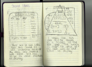
Stand Designs After looking at the Maybelline stands in retailers like boots and super-drug I started to sketch down my own designs. These were just quick sketches with brief description about what I was thinking behind each design.   This show the first two sketches. These are both quite different as the first one is a lot more simple with just some slight differences to the original stands but there is nothing to unique about it, but the second design is very different to anything I have ever seen in the drug store. I used the idea of shapes from the new logo to incorporate into the design as I though it would be a good way to link the new branding into both re-designs.  After designing the second sketch I really liked the idea of using shapes in the stand but I though that the first design might have to little space for products as it is using up more negative space. This is why I came up with linking up separ...
Maybelline Stand

Image
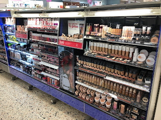
Maybelline's Current Stands Boots This is a photograph of the Maybelline stand in my local boots. The first thing I notice is that there is three panels at the top that have broke off which is exposing the lighting. This isn't ascetically pleasing and I would hope mine would not be as easy to brake. They are also using a lot of dark blue which the brand used to associate a lot with in the past but in the more current years they have slowly took it out of there packaging. This is another reason why I thing that the Maybelline stands need to be updated. This stand is one of the biggest in the store which is needed as the brand is one of the biggest, what I like is that they have still used space to use some visuals from photoshot and it also has the logo displayed on there. This is good as the top panels aren't there you can see the main logo that would usually be used. I do like the fact that they have most products placed together which would h...

Aged Skin Packagine

Image
Final Packaging - Aged Skin I new that the aged skin range was the smallest range. This is because The skin doesn't need as many products as well as having a two in one pallet in the range. I went with a orange shade like I originally wanted, this was because orange is complementary to yellow. When on the stand in the shops all three ranges will work perfectly next to each other. I also stay with the same designs for products in the same product line, but the concealer was different so I had to create a new design for it. The design I came up with is related to rewinding in time when it comes to the skin. Once i figured that out the packaging was mainly done as the other product packaging didn't need as much differentiating. The safety information was the same on the product packing in this range as the last. I made sure that the placement of every piece of information was the same as other so there is consistence in the range.     Aged Skin - Primer ...

Oily Skin Packaging

Image
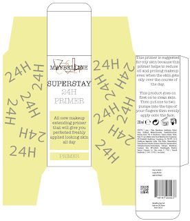
Final Packaging - Oily Skin I have finished the packaging for the oily skin range, this range has eight products in it like the dry skin range. I have shown both the finished versions as well as the draft before adding in the safety information. I chose a yellow colour tone for this packaging as it is a compartmental colour to green which I used for the dry skin range witch I have designed for beginners who are looking to learn more about make-up.  With these packaging designs I tried to follow the same layout I was using for the dry skin range before. I am happy with all the packaging layout. I believe the information is positioned in a way where its easy to see, read and scan when being brought.        Oily Skin - Primer  Oily Skin - Foundation Oily Skin - Concealer Oily Skin - Highlighter   Oily Skin - Powder Oily Skin - Contouring / Bronze ...

Behind The Zine

Image
Behind The Zine I am really happy with the outcome of my Zine. I have taken a different approach to the message in it then others. I new that I had already done most of my research quite early on so by the time we got onto the zine I didn't want to show all my research again so I chose to show the development and individual research for the new logo. I had been creating multiple design pages with ideas I had developed and from there steamed an idea that I went on to show in my zine to get a final logo.  1) The first page is the front cover and like I have spoken about before I wanted this to show how I wanted the brand to develop from what it used to be into a new 21st centenary modernised brand.  2) Then I went on to first double page spread , my main  focus for this page was to show my ideas for the brand. I wanted to talk about what diversity was and why it was important...

Cosmetic Products - Safety Regulations

Image
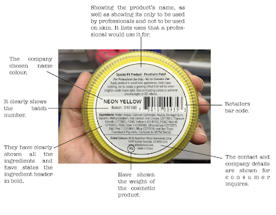
Safety Labels After finding the official legal document provided by the government on there cosmetic laws in the UK I was able to get a better understanding of what my packaging must include. This was informative because I do know that there has to be correct labels on packaging so that the consumer can see if they want to use it but I didn't know know enough  to create my own packaging  that applies with the law. I realised that the main Legal requirements are ... 1) All products should show on there packaging the correct labelling requirements. They have to comply with the law other wise they will be shut down.  2) All cosmetic movement should be recorded between retailers and records will be checked within a three year period, so the company's must provide the correct paperwork for ever sale or perches to prove the authenticity of the cosmetics. 3) The distributors should provid...

Dry Skin Packagine

Image
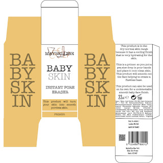
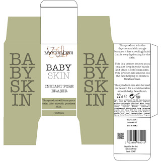
Final Packaging - Dry Skin I have finished my final packaging for the dry skin range. This page shows you both the finished off shelf product and the finished design before adding in the safety requirements. I stayed with the same layout through the packaging, this was important for me as I wanted them to look like they are in a set and are meant to be used together. When necessary I have had to move things around but thats because of the space I had on that box size. When fitting in all the correct safety requirements I sometimes had to tack out some text or move around text that I had placed down before. This is another reason why I put the original image in of before I had to add in the safety requirements.  Dry Skin - Primer Dry Skin - Foundation  Dry Skin - Concealer Dry Skin - Contour Dry Skin - Highlighter Dry Skin - Blush ...