Posts

Showing posts from February, 2018

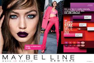
Chosen Brand: Maybelline New York
Image
Maybelline New York After researching a bunch of well know drug store brands to pick as my client I have decided on Maybelline New York. I picked them as I believe I would have a little bit more freedom with the design as I was very close to picking L`Oreal as well, if it wasn't for L`Oreal having other franchises under the same name I would of gone with them due to them having in my opinion a bigger range of products but I didn't want to limit myself to making the logo still recognisable to the original as I think that would of limited my creative flow. Making the decision to go with Maybelline New York is still very positive as they have grate products that I would feel confident recommending and working with as well as a big range to work with. I love the fact that they work with iconic models that are very trendy and can help promote the new campaign to the world. I wanted to do some more research into the background of Maybelline and how it started. This is 

Maybelline Survey

https://www.surveymonkey.co.uk/r/GFQ3RYJ

Potential Client

Image
I need to look into drugstore make-up brands that I feel need the most help and have the resources to work with the ideas I have. This is why I'm going to be looking into all the biggest brands in the drug store at the moment, so that I can come to a thorough decision. The first make-up brand that I am going to look into is L`Oreal Paris. As you know I already saw one of there stand in my local boots which I talked about on my issue page but I do think this brand would be a good one to chose as they have got a lot of products that I know to be good as well as having products that vary in type. What I mean by this is that they have mutual foundations and mascaras that all do different things which is good as I would be able to help people pick the products that are good and right for there skin type. I do think that this brand could do with a makeup reboot as they do have many other branches under L`Oreal like there skin care, hair dye, hair care and mans skin care. This is de

Campaign Posters

Image
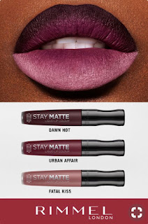
This is a Rimmel London campaign poster for there new lip products. These products are liquid lipsticks that dry down matte. These will not move like a regular stick lipstick and are also a very popular product for make-up brand to make recently but the problem I have with this poster is that they are showing off all the colours on the poster on one lip model. In this particular shot the make-up artist has created an ombre lip to show of all the colours in one which looks grate but they don't explain what that is or even any pointers into how to get this look, which to me would be a wise chose as if they explained how these colours were chosen to work best together then they would be getting a double purchase making the buyer want to get multiple colours to try out the technique themselves which needs two or more colours to work. In my opinion I think that not explaining the idea behind the campaign for the new products they are losing interested customers and potential profit.

The Issue

Image
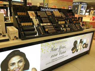
As I have said before in high end shops that sell expensive designer makeup there is a lot of help that you can get. They have professional makeup artists to help you so you can gain help from the people qualified to know best. They also have grate presentation, this is because you are paying for the name so it has to be respectable and luxury.   In this photo I went into the shops and looked for my self what the issue is that I want to help. As you can see this photo shows a bare minerals stand that was in house of Fraser. This is a high end shop that distributes all the top designers from make-up to fashion and even house accessories. This is why the presentation has to be perfect as well as easily displayed. The products on this stand are categorized with different products that are go together as well as having the same product in the same space and I know that this might sound very basic but sometimes in the drugstore there are products that are the same placed in two diffe

What about sales assistants ?

Image
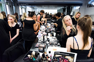
I know that there will be people who say that there are sale assistants  that can help explain makeup to people who don't know much about makeup and everything that it can do. This is what I disagree with as most sale assistants are in more high end stores like house of Fraser and Selfridges. when your in these stores you can get help very easily with help in what your looking for but when your in the drugstore you don't get as much help and the sale assistants as there are not specialised in makeup like in the higher end shops, also I don't believe that the average person who isn't that into makeup but just wants to understand it a bit better so they can get the most out of it would want to spend the time and money going into the higher end stores. This is why I want to create a stand and brand that can help explain in the most simplified way why someone might need a certion product as well as what it can do if used properly. I believe that my rebrand company stand wi

PINTEREST MOODBORED

Image
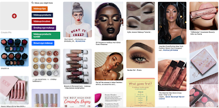
These are my pinterest bored that I made to gain some inspiration as well as help show what thoughts I have. What I mean by this is that I wanted to show some of the brands and products that inspire me. There are also some shots in there that have information on makeup brushes as well as information on makeup itself. This is what I want to do with my beauty stand having lots of easy to see and understand pointers next to the products to make it easy to understand. There is also shots in there from beauty campaigns that show makeup product in use as well as individual items to show them in its packaging as well as in use. Overall I think that having this moodbored is going to help other understand my work.       

Product Proposal and Timeline

Section 1: Rationale In the beginning of this course I knew that I wanted to work in visual communications, as I have always loved the thought of working in that area, designing packaging and campaigns. I have also had experience in fashion and 3D in the past, but I realized that I am not as passionate about them, so I wanted to create a theme for this new project that will allow me to use these skills, but focused on visual communication. This is why I decided to create a theme and project, that would allow me to use my new skills that I gained from my last unit. This allowed me to develop skills in adobe illustrator and adobe Photoshop. I have already had experience in packaging design from AS education which is why I came up with the idea to put both of these together and create a project, that would allow me to create a visual campaign as well as packaging and  other physical objects for my designs.       Section 2: Project concept