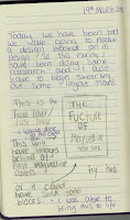
Front Cover Options The first page of my zine has two designs as in my journal I sketched out an idea but I had two ideas for the background. This is why I have two different options here but I have to look into the both and decide which one I think is best shows the message I am trying to send as well as the most ascetically pleasing. The first idea that I spoke about in my journal was to have past campaigns in the background of the front cover with the text bold over the top saying “THE FUTURE OF” then the Maybelline name logo that I have chosen as my most favourite design. This idea at first wasn’t working out as I haven’t used In design before I didn’t know how to make an image smaller when copying it in, but after playing around with it I figured it out. This allowed me to create the cover you see to the left. The campaigns in the background are older campaigns which I copied over and sized down to fit onto the page, then I set he t...
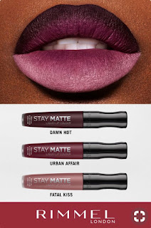
 This is a Rimmel London campaign poster for there new lip products. These products are liquid lipsticks that dry down matte. These will not move like a regular stick lipstick and are also a very popular product for make-up brand to make recently but the problem I have with this poster is that they are showing off all the colours on the poster on one lip model. In this particular shot the make-up artist has created an ombre lip to show of all the colours in one which looks grate but they don't explain what that is or even any pointers into how to get this look, which to me would be a wise chose as if they explained how these colours were chosen to work best together then they would be getting a double purchase making the buyer want to get multiple colours to try out the technique themselves which needs two or more colours to work. In my opinion I think that not explaining the idea behind the campaign for the new products they are losing interested customers and potential profit.


Comments
Post a Comment